These pieces—a flyer, menu, and logo—represent some of the key milestones from my high school and college training in graphic design. Each project was created primarily using Adobe Illustrator and reflects my growing skills, creativity, and design sensibility.
The ice cream logo holds special meaning for me—it was my very first design project and the moment I realized I wanted to pursue graphic design professionally. What started as a simple classroom assignment quickly became a source of inspiration, igniting my passion for visual storytelling and creative problem-solving.
These early works laid the foundation for my design journey, and I’m proud to include them in my portfolio as a testament to where I started—and how far I’ve come.

Original Artwork- Made it in school, but kept it as my own original logo. Using special effects on the font to make the words pop up, edited the whipped topping on the “I” to let people know what the logo represents.
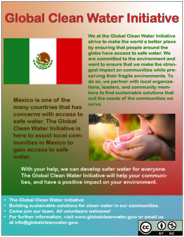
School project- I made this poster in one of my graphic design classes in college. My teacher gave me the content, and I had to rearrange it in a way that made sense. Using gradient style for the red, white, and green colors, using those same colors for the text to see the content in different spots.
Here is an example of a menu design for the Frenchy’s Restaurant chain.
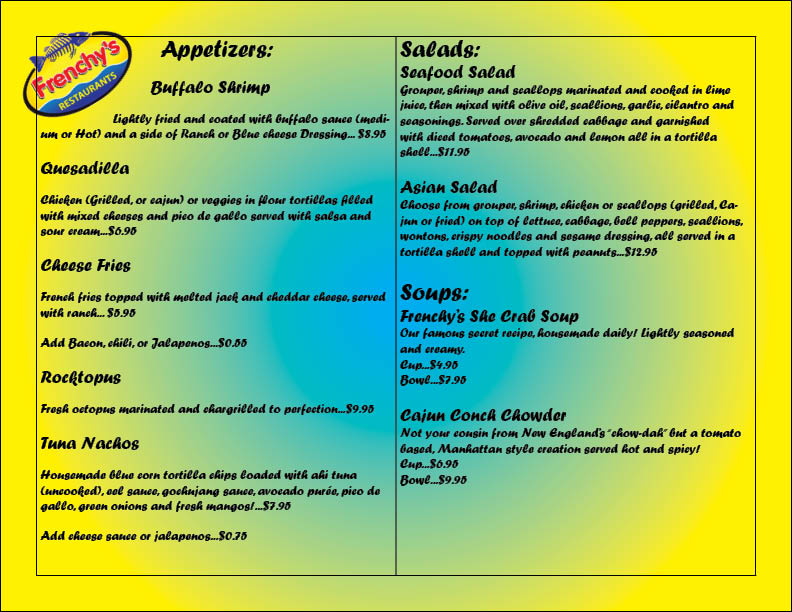

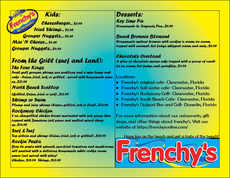
Original Artwork- I used InDesign for this original project. I do love Frenchy’s and I wanted to make my own version of their menu. I used gradient style with the yellow and blue colors, used two columns to help organize the content on each page, and used a few different font styles for each page too.
