I created several pages and covers for magazines in Adobe Illustrator and InDesign.
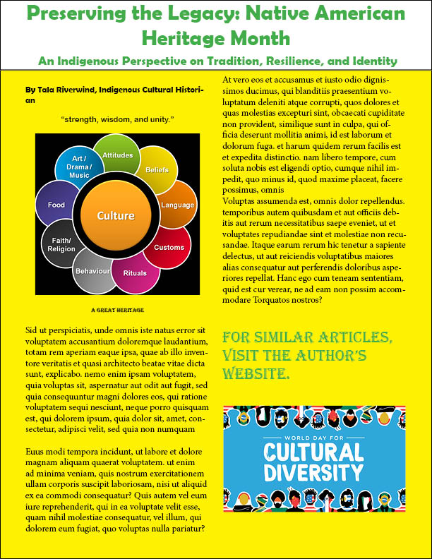
This magazine layout was created in Adobe Illustrator as a visual exploration of cultural diversity. I chose a bright yellow background to evoke warmth, energy, inclusivity, and setting a positive tone for the content. To ensure readability and contrast, I used black and green text, which not only complements the background but also adds visual interest and clarity.
To enhance the storytelling, I incorporated carefully selected images that reflect the themes discussed in the article. These visuals help ground the content in real-world representation and make the message more engaging and relatable to the target audience.
This project challenged me to balance aesthetics with accessibility, and it deepened my understanding of how design can amplify important social topics.
Samples of ticket designs
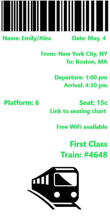
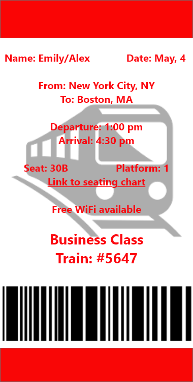
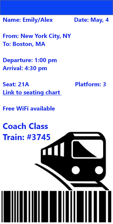
This train ticket design marks my first experience using Adobe XD, a platform tailored for UI/UX design. While I was new to the software, I quickly became comfortable navigating its features and crafting a clean, functional layout.
To bring the concept to life, I incorporated perfect images of a train and a barcode sourced from Google, and designed the typography and layout myself, arranging the text in a logical and visually appealing order. The goal was to simulate a realistic ticket interface while experimenting with hierarchy, spacing, and alignment.
This project was a valuable introduction to digital product design and helped me understand how visual elements and user experience come together in interface design.
Here are some more social media designs for different digital platforms:
FaceBook:

Twitter:

Instagram:

Thread:

This series of social media ads was created in Adobe Photoshop, applying knowledge gained from my multimedia classes. I explored how different platforms—like Instagram, Facebook, and Twitter—require unique dimensions, formatting, and tailored each design accordingly.
To ensure consistency across the series, I used the same font for all titles, creating a unified brand feel. At the same time, I introduced distinct color schemes for each version to reflect the tone and audience of each platform. The imagery was sourced from Google and carefully selected to complement the message and visual style of each ad.
This project helped me understand the importance of responsive design, visual hierarchy, and brand consistency across multiple digital channels.
